Plot MACD swings on chart
-
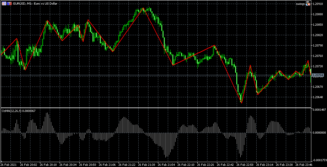
Here's a nifty little framework for plotting the MACD swings (or OsMA swings to be precise) on the price chart, like zig zag. A starting point for a larger project of mine, thought I'd share this to anyone interested...

-
I might as well share more, now that I started.
https://fxdreema.com/shared/z6zjcToLbI used those swings to create statistics for each hour of the day, as we know volatility is different at certain periods of the day. I used some data filters to calculate 3 expected swing sizes for each hour: pessimist case, average case, optimist case.
Now that the EA knows the expected swings for each hour (analyzed from 10 past days), we can plot the estimate when MACD cross happens:
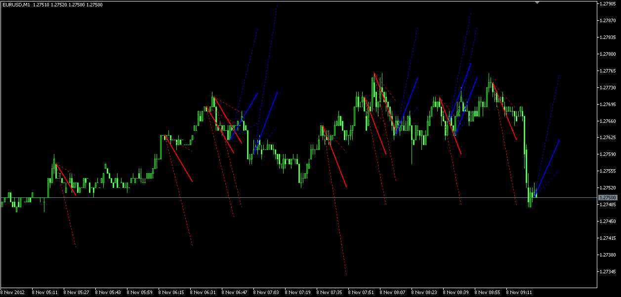
This EA doesnt have any mechanism to predict the direction, it only shows how big the the swing is most likely to be, if it happens.
TLDR: This is just an overcomplicated ATR indicator, lol
Need small help? Tag me in your post
Need big help? https://www.fiverr.com/big_algo/automate-your-winning-strategy-in-mql4-or-mql5 -
@roar Impressive, as usual!!

-
@roar
Then it would be a kinda ATR indicator, but plotted on a chart, and anticipating a potential move rather than evaluating a preexisting one. I didn't fully study the project yet but I think I get the logic.
Do you use these lines to place the exits proportionally to the size of the anticipated swing ?
Closing 1/3 of the position for each -
@seb-0 yes, its basically ATR without the lagging effect of taking average from past values. I didn't continue that project any further