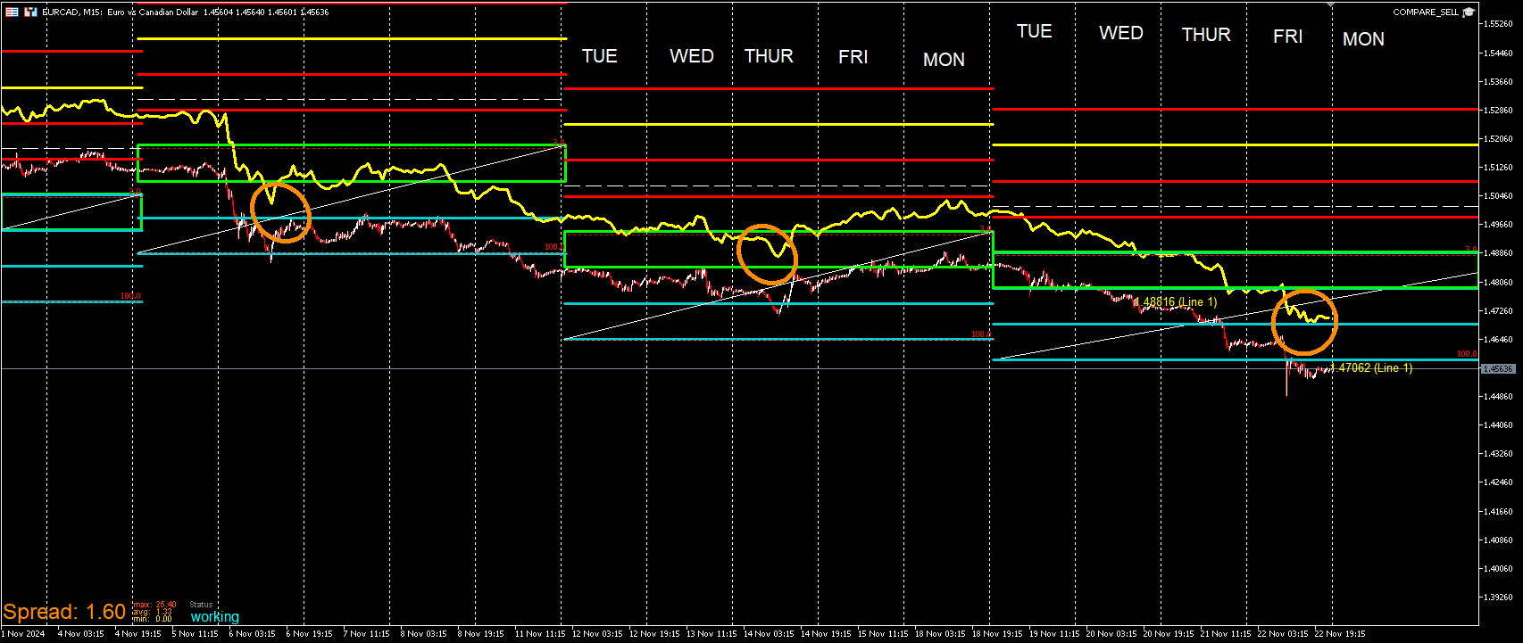
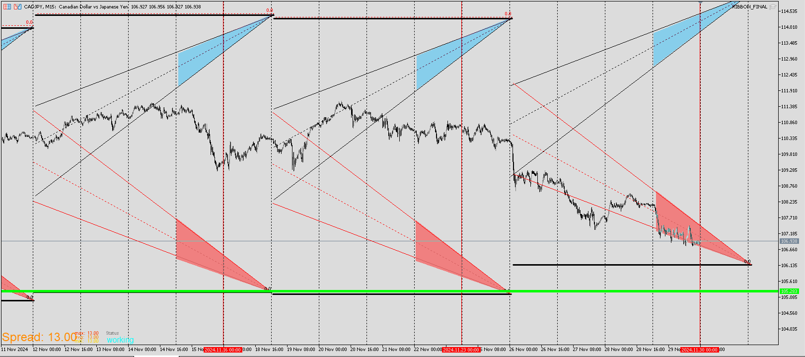
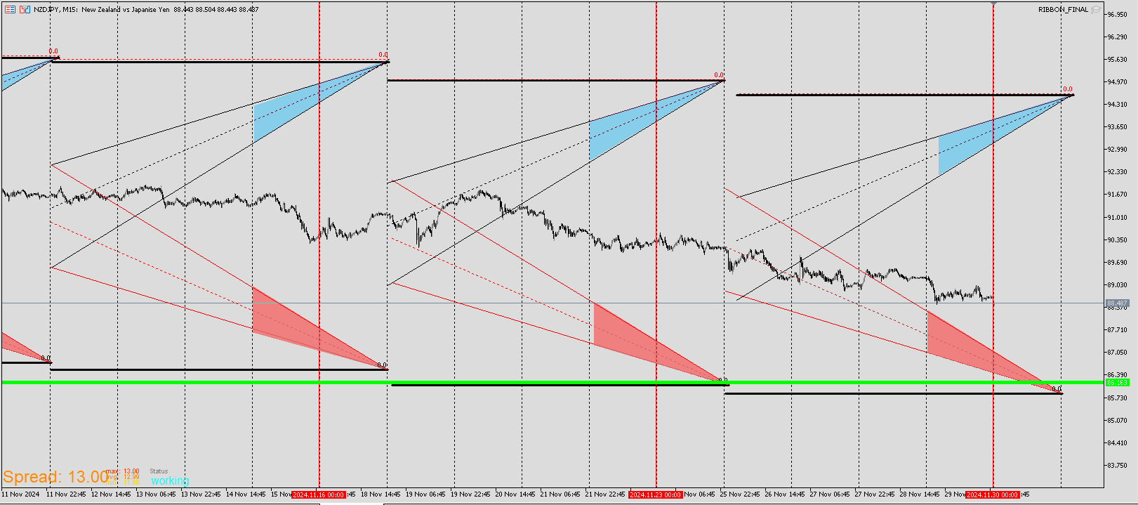
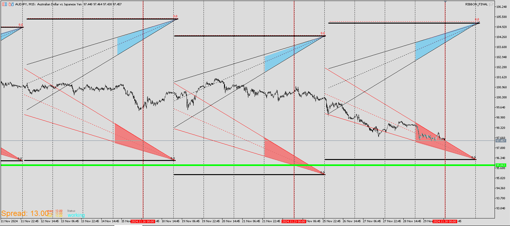
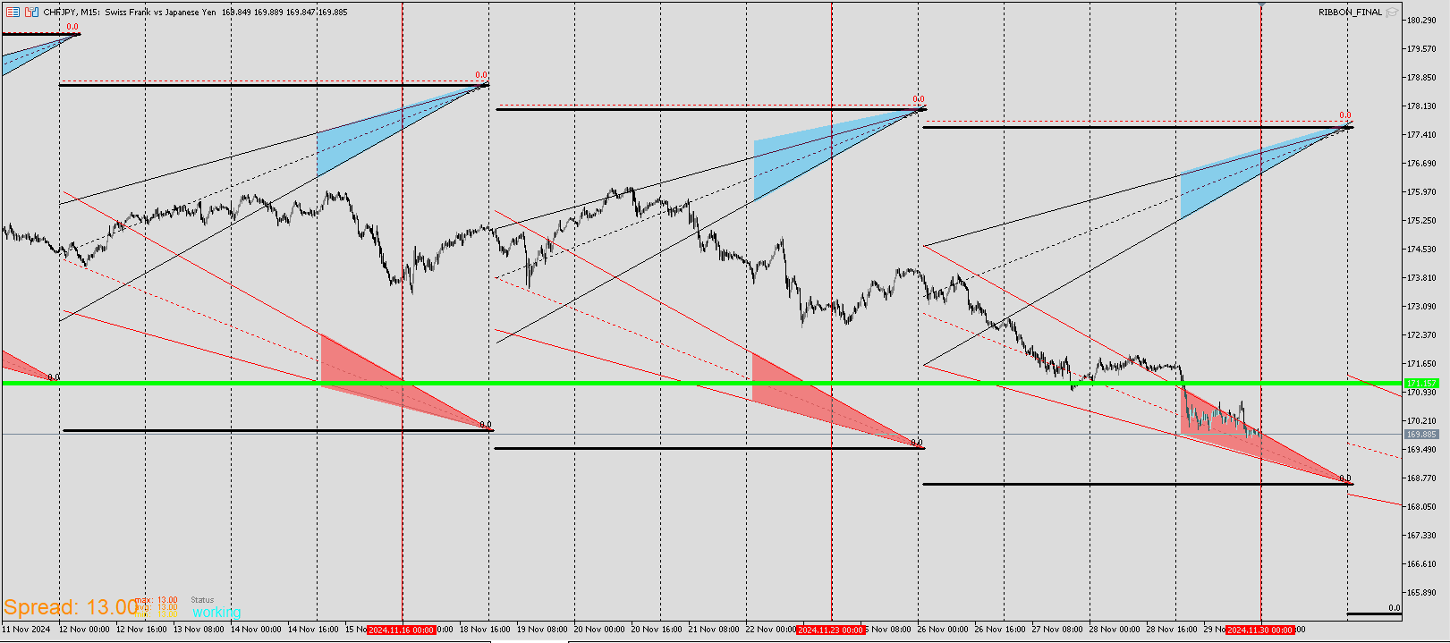
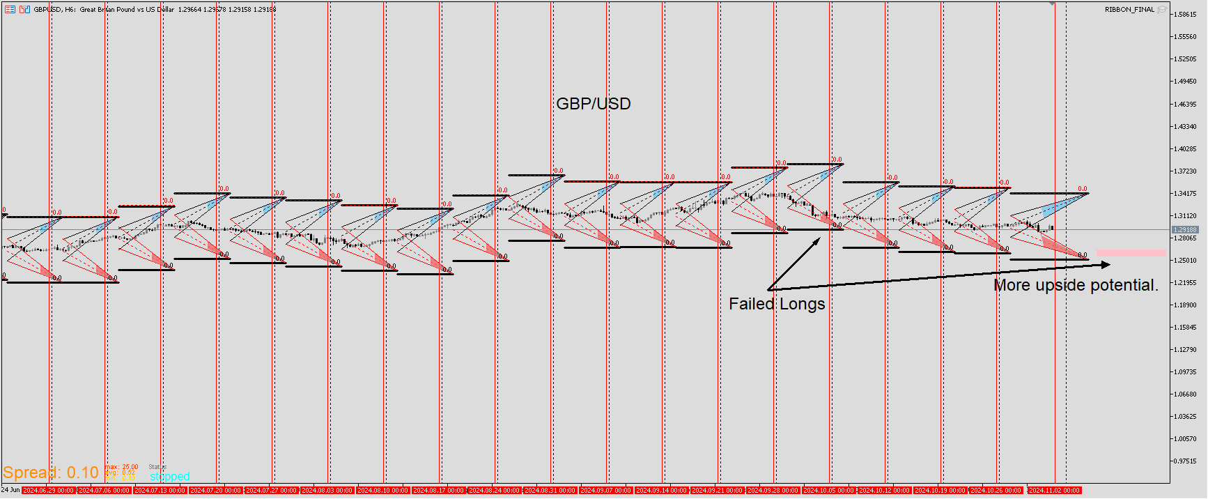
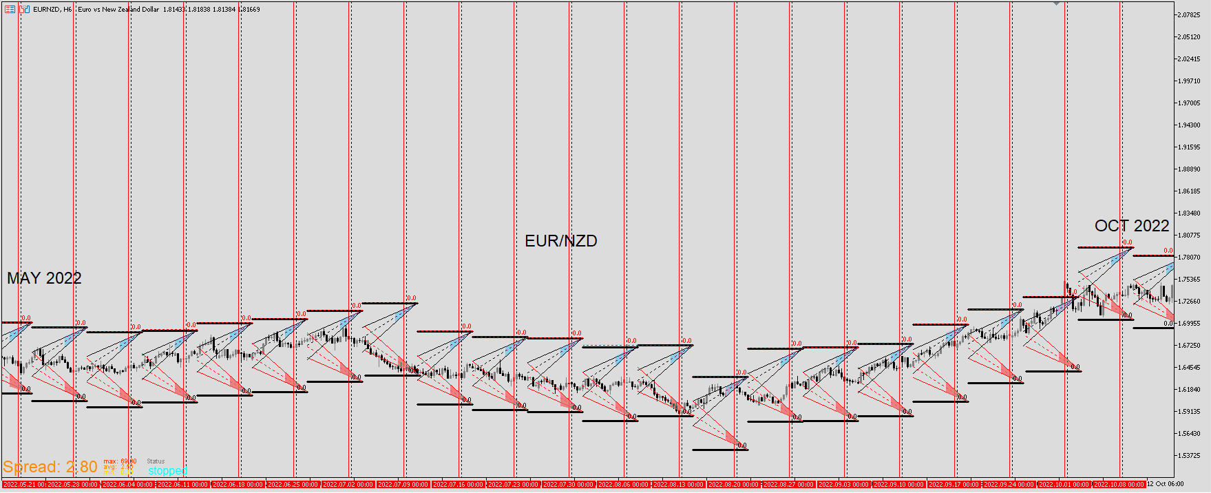
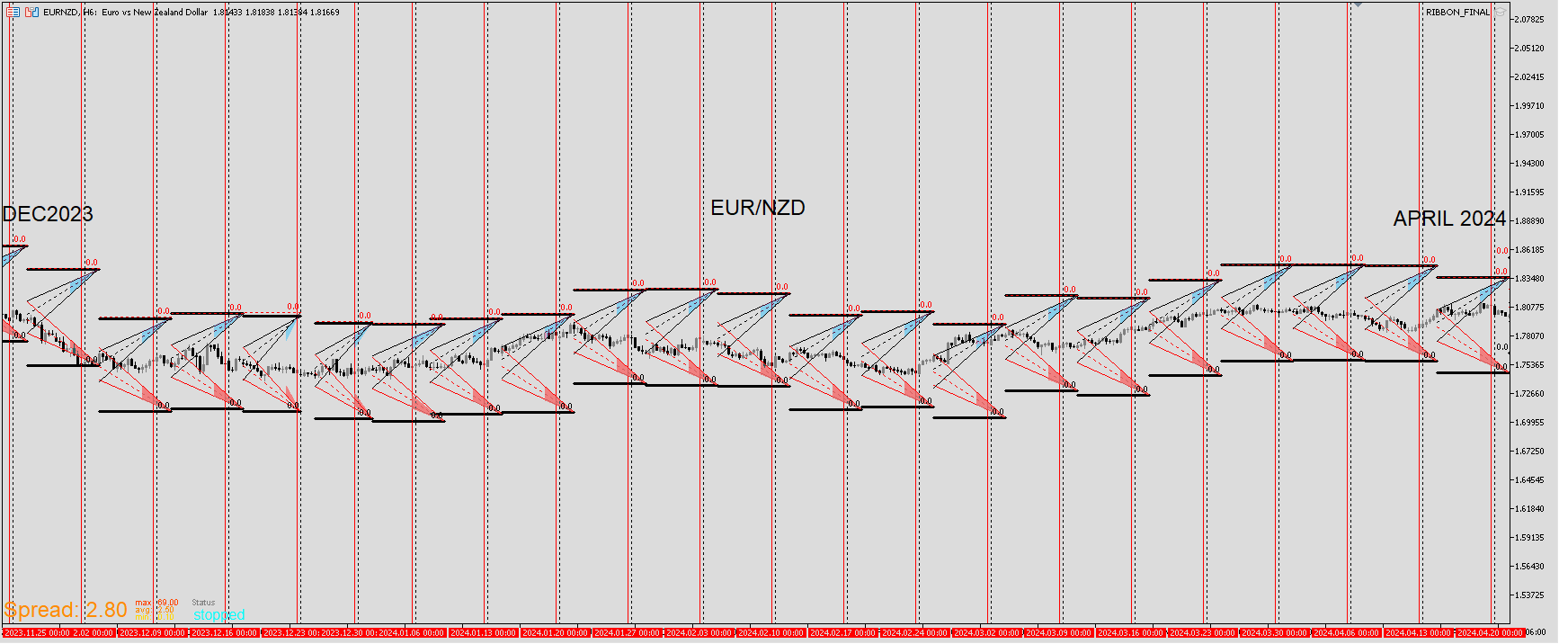
I'll be starting with EUR/CAD. In this example I'll explain why I expanded on the Wall template. Though I still use the original and think it's still useful to have. It's not a great entry tool. I see it mores o as a canary in a coal mine meaning that something is to come. Look up that phrase if you want the full depth definition but that's the gist of it. I don't want to sell on the bottom wall. Price could continue but I'd rather be on the safe side and be long but only if other analysis supports it. Regarding this template, I've always struggled with picking which line. The Ribbon template eliminated that problem as well the green line template. Plus there are templates designed to spot what would be good entries. It's good information to know that price is nearing these levels.
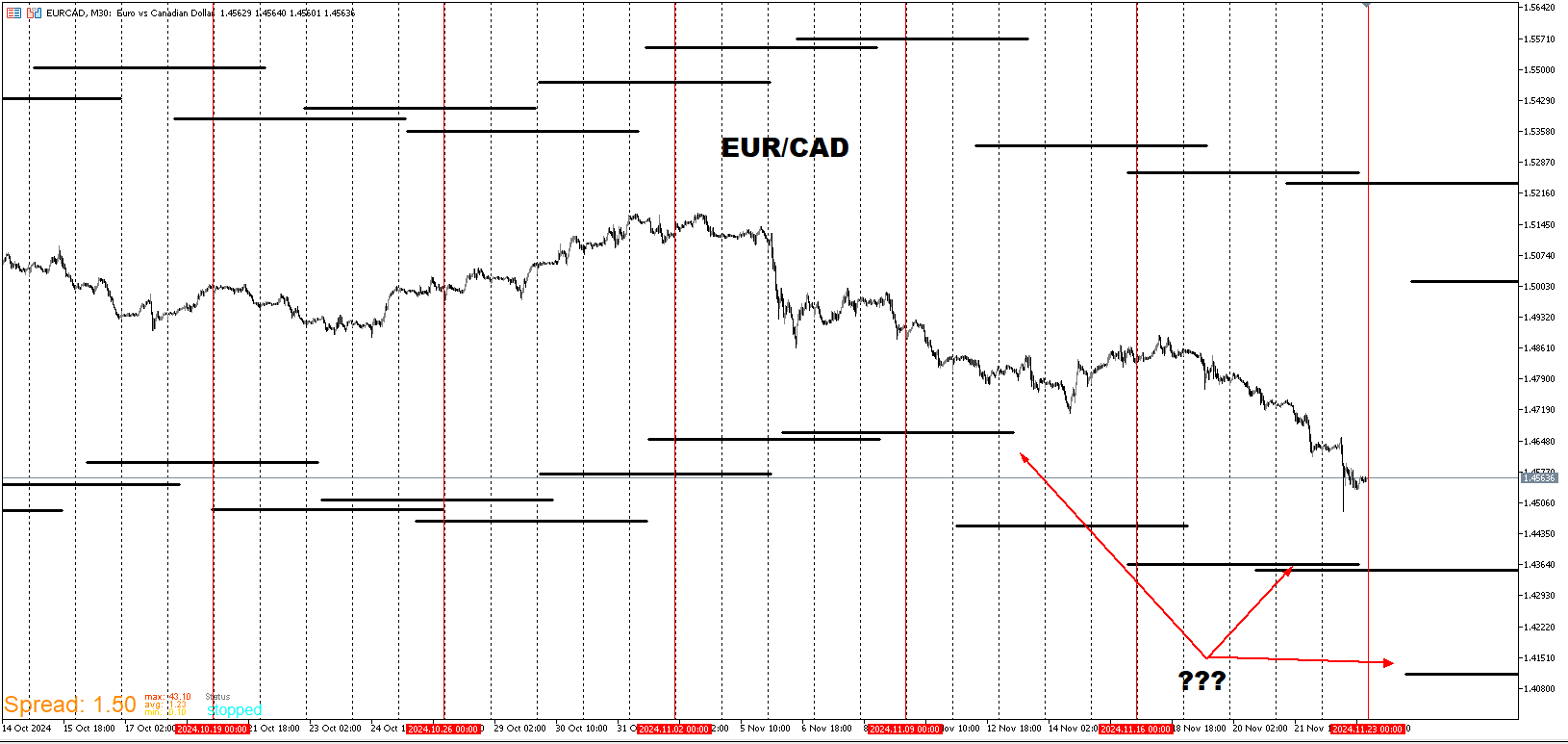
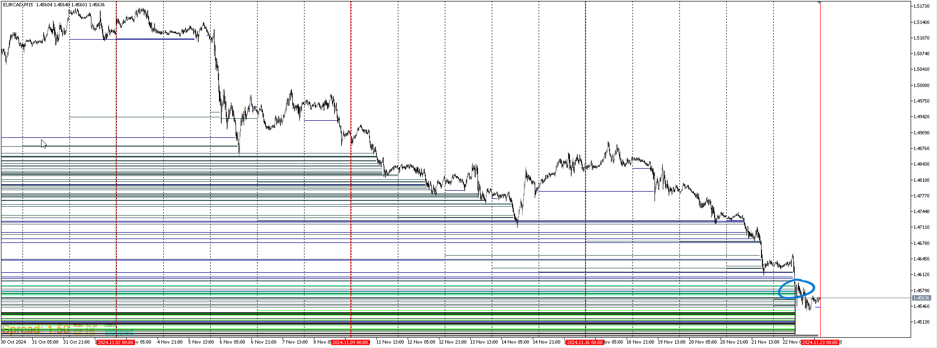
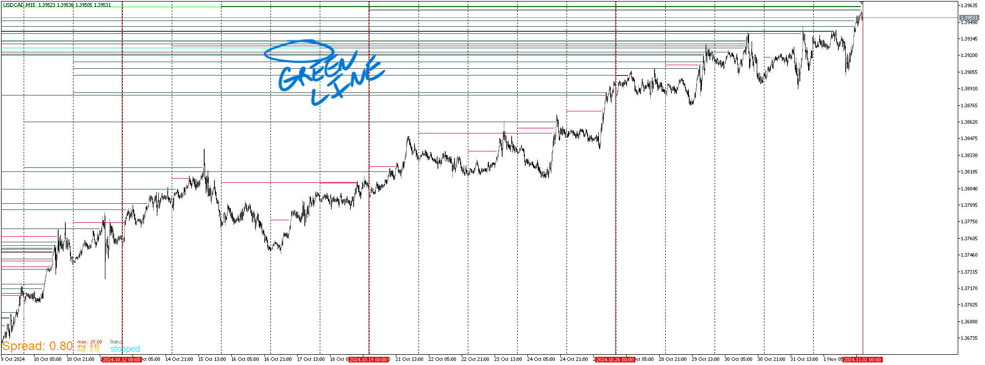
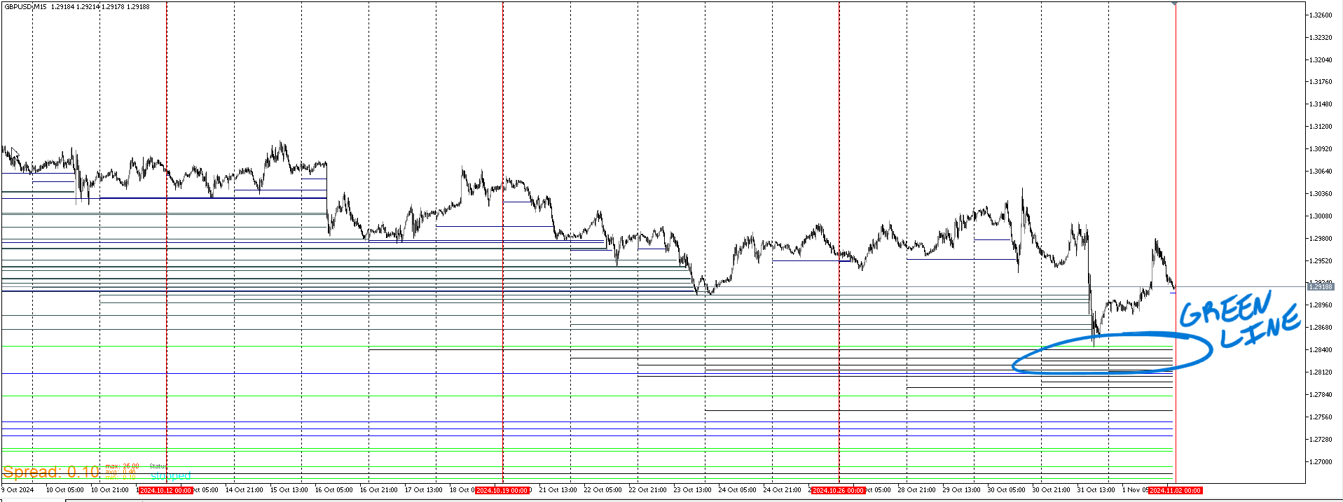
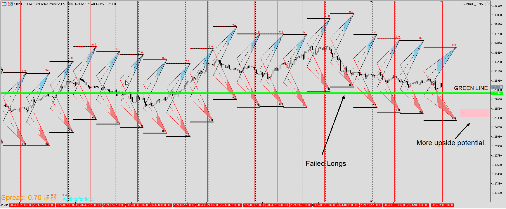
For some reason the most recent week graphic scale is always slightly larger than the previous ones. So price is always slightly higher once the new week is displayed. To counter this, I look for price to be well within or below for a more accurate reading. When price barely touches it, it's fair to assume that the adjusted print will be slightly off but not biggie. This helps to know that it's rare that price will continue down. Doesn't mean that it can't happen. It's just more likely to consolidate and provide some upward movement if it does intend to go lower. There is also a somewhat shallow dig below the green. It doesn't have to go deep every time but fact is the trends worth getting in on start below here. Don't want to be a buyer before price gets below there.
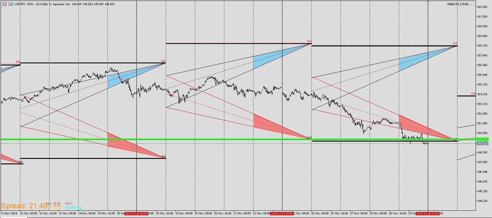
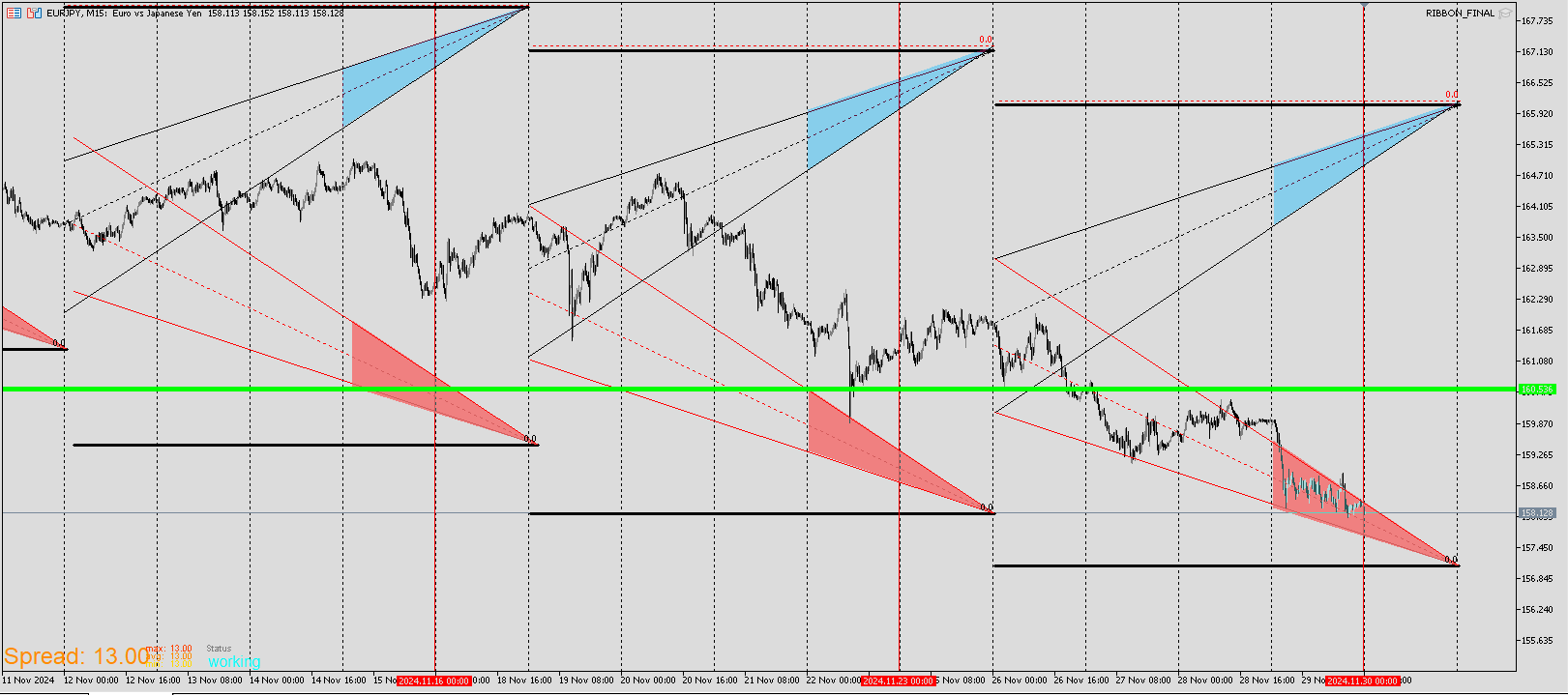
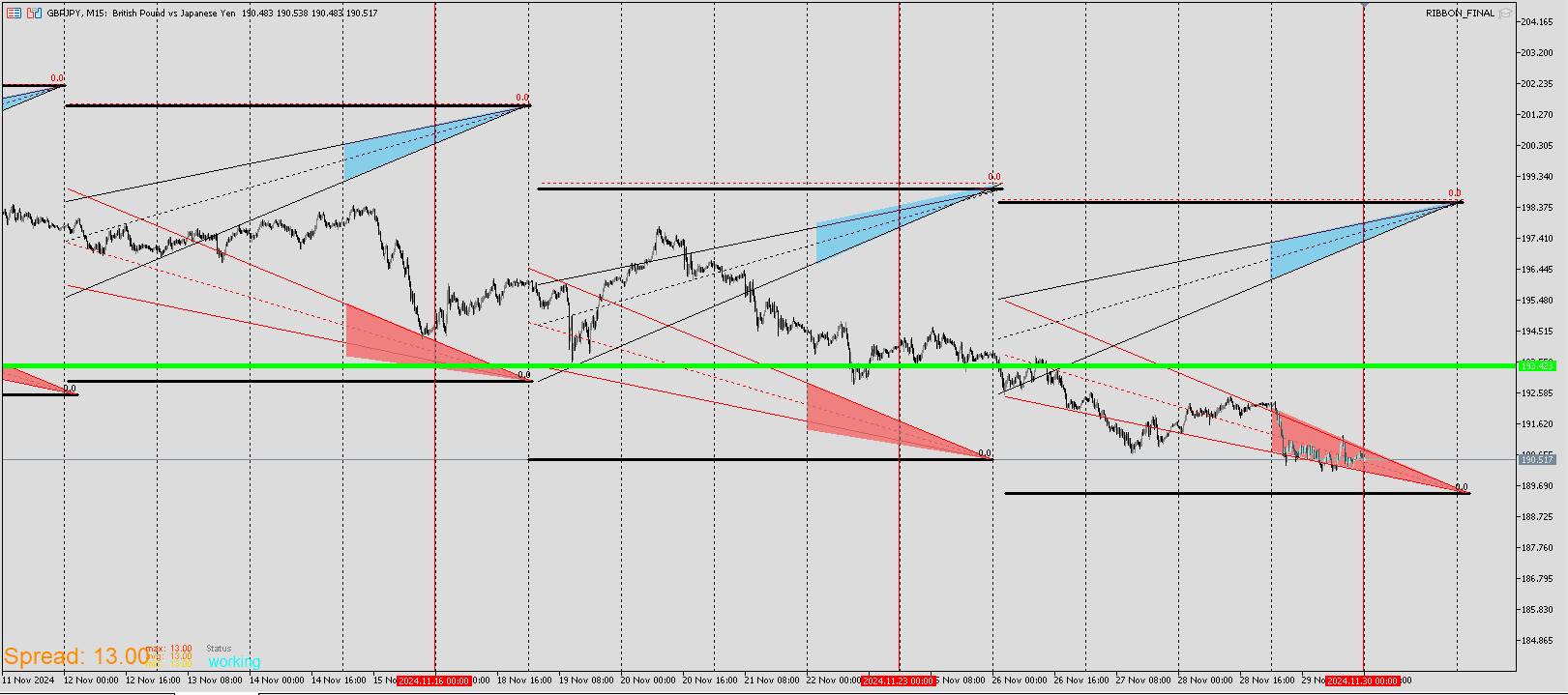
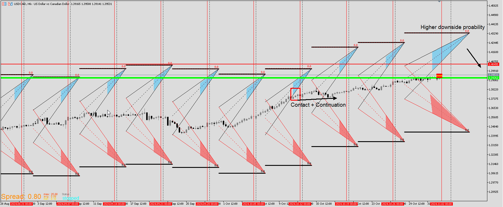
Here is a recent EA that's completed. It's purposes are analytical and entry. There are two versions of this. Long entry red lines on bottom blue at top and short which is vice versa. For the long template, there is a yellow tracer that is a fixed number of pips below each candle.When that tracer nears or go below the yellow trendline, that's where I will look to enter.This isn't something that happen often. but it does with every pair a handful of times throughout every year. It's not often that actual price reaches the yellow trendline and even more rare that price touches the tracer. Here price is touching both therefore a high likelihood for a reversal.
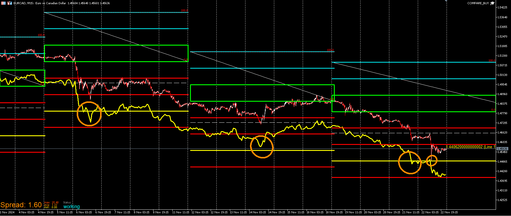
Inversely here is the sell version.It's the same concept but flipped to the upside. I can still use information on here for longs. I look for the high tracer to be within or below the green box. When the yellow high tracer get be these zones more particularly within the blue trendlines, there is more likely to be a retracement back up. It's not likely that the tracer will continue to crash down through especially if price has already been in a downtrend. Equally when selling, I look at the buy template low tracer to see if it's nearing the green box and above. These templates start on Tuesday and end on Monday.